Tuesday, September 25, 2018

Albright Knox Reaction

What artwork stood out to me?


Naum Gabo , Linear No. 2, variation
Stainless steel coil on plastic 1962-65


This piece stood out to me because I have never seen anything like it. It had an organic shape but it was made out of straight lines of coils. I had taken some time walking around this piece to make sure I got to see every angle and possible view point.


Mary Bauermeister, 
Four Quart-er-s. Lenses, found objects, drawing. Approx. 3x3ft, 1965


This piece really caught my eye because it made me feel like a child again. I was trying to peak around the edges of the lenses and see the drawing get bigger and smaller through the glass. 


Which artworks did I have a connection with?


Julio Le Parc, Unstable Continual Light. Metal, wire, wood. Approx. 3.5 Ix 2.5 ft. 1962


I had a connection with this piece because it instantly brought you in. The piece wasn't only trapped in the wooden box, the light reflected on the ceiling and on the floor, as the breeze from on lookers went by the lights danced. It is a piece that easily draws you in and puts you in a fairy tail atmosphere.


Peter Ford Young, Number 22. 
Acrylic on canvas, 1968


I had made a connection with this piece because it looked like a controlled chaos, but surprisingly gave me peace. As being a college student, trying to figure out money and having a lot else on my plate, to see something that large and chaotic and me feel at ease. To be able to relax and realize somethings do seem messy and stressed but it turns out okay. 


Which would I like to know more about


Miguel Angel Vidal, Focos de Luz, Acrylic on canvas, Approx 5x5 ft.1969


I selected this piece to know more about because I just have so any questions. At some point in my life I would like to be able to do something this intricate and mesmerizing. I would like to know how its done, how long it took, what was the story behind the color choices? 


James Rosenquist, Nomad. Oil on canvas with plastic and wood.1963


This piece is such a unique one I was just so intrigued to know the meaning and story that lies behind it.


Logo Development.

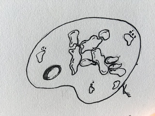
When creating my logo, at first I wasn't sure what I wanted to say about myself. So this is what came out first, an abstract view of my signature.


I wasn't liking my first try at all. 
I wanted to show my signature with a paintbrush. Simple showed me enough without being in your face obnoxious.                                               
So then I wanted to go back to my signature that I put on everything and I wanted an art element to it, I liked this one but still thought it could use more.


Then I realized that I have more to
offer than just painting. I do crafts, 
I draw, I print, I do custom work, 
really anything.


So I left of with this one. Easy to see, simple
shows I have a lot to offer.From the videos and power 
point I learned that a logo must be simple, strong and 
must show who you are as a person or a company.

Tuesday, September 18, 2018

Shading and Color

I thought making the color wheel and value scale was a simple task but good to do again. I have taken many art classes that require you to go through this process but I hadn't done it in a long time so I thought it was a good thing to be brought back up. I enjoyed working with the paint more because it is something I am more comfortable with. During this process I discovered that I really don't necessarily need all the paints that I have, that all i REALLY need are the three primary and a black and white. After watching the video, it made me feel as though that's what they need to teach children, why try to simplify things for them when that is not the truth.

Sunday, September 16, 2018

Elements and Principles Photography

I highly enjoyed this assignment because it brought me out of my comfort zone. I had originally wanted to go right outside for this project, I saw many opportunities but thought it may be more difficult if i look around my surroundings in my own door room. It was a struggle just like I thought but I am happy with the outcomes.


KaitlynnGrevell's library on Photobucket

Friday, September 14, 2018

Color and Emotion

We have known for  some time now that people are drawn to certain colors and that color has psychological effects for us. For instance it's known that if you have an agitated person, showing the a certain shade of pink can calm them down. Green is known to spark creativity and blues are known to be calming. Now during our day to day lives we don't notice these colors are making us feel these ways but they do and we understand this but yet few question it. Color is a very powerful thing to humans emotions. 


What has always been fascinating to me is that color is just light reflecting so, then when something reflects in water, that is just reflections of reflections but the color still holds true to the same color of the object. Our eyes and minds are amazing things ans so is color.


In the Color video, the woman artist had said that the feeling she gets from her painting is dependent on the colors she uses, as soon as she finds the right mix and correct use of color she then fells much better and happier with her work. This stood out the most to me because I could relate and now understand. It made me question what if  I had changed the use of color in my work. Would have sold faster? Would I have been happier with it? 


While watching the video, Feelings: Emotions and Art, the narrator had described the similarities and differences in the artist David and Goya. When their art is viewed it has a way of making you feel something very different, almost strangely like you are there, watching and feeling along with them. What stood out to me that even back in the 18th century they understood that if they used certain colors they could convey their ideas about religion exactly how they wanted to. Goya used dark colors like reds, greens and black which makes you feel on edge, angry, and stressed.

Sunday, September 9, 2018

Module 2 Post.

While watching the videos I learned alot of new information that I thought I already knew. some of the concepts that I earned was:

  • Baumgaten coined the phrase aesthetics.
  • Most can agree that most all objects or things can be treated beautifully but everyone is subjective so finding a definitive answer to beauty is impossible.
  • Romanticism was the climax of spiritulization 
  • Dionysus the Goddess of wine, had a part in shaping the beginning of music
  • The core of art is mythological
  • No theory of art is possible
  • Aesthetics dates back to ancient Greece.
Which philosopher's theory on aesthetics do you feel is most important? 

        I felt as though Kant's theory in the 18th century was most important because he was the first to bring to peoples attention that you can not put a description on beauty, that every will see and interpret things differently.


What do you think  Ramachandran scientific view of aesthetics and art? 

        I believe that Ramachandrans work is eye opening. To see that our minds are in a way hard wired to like and really gravitate towards certain kinds of art works such as more symmetrical ones is my favorite, most interesting part about the reading.

The videos and articles gave more light to topics brought up in the reading in the textbook such as the view of aesthetics. The first video really went into detail on the starting point of aesthetics and really broke it down and the book tied it all up very nicely.


New Media Artist Blog

What is the topic (what artist) of your presentation and why did you select that artist? The artist I chose was Danny Rozin. I selected t...